By Andrew Ausel | December 1, 2015
Do you reach for our famous design-build authorization maps every time you see our booth at a conference or event? Well DBIA has undertaken a series of improvements recently that are sure to shake up the materials you traditionally see at conference tables or on our website. If you were not at the Annual Design-Build Conference and Expo, you may have missed one of our many important updates, so we would like to take this opportunity to highlight our new maps that we hope will help you better understand where you can use design-build.
History of our maps
These are not the first changes that DBIA has made to the maps; in fact, they have evolved mightily in the few years they’ve existed. DBIA’s maps have played a crucial role in tracking the growth of design-build over the years and each improvement we make is intentional in order to further our goal of promoting Design-Build Done Right™. The design-build maps were first created in 2009 when we also created our state statute report. The first map illustrated procurement laws as they stood at the time:
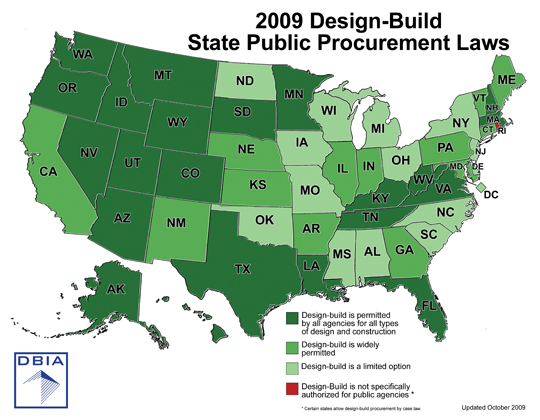
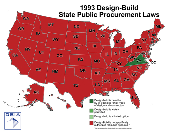
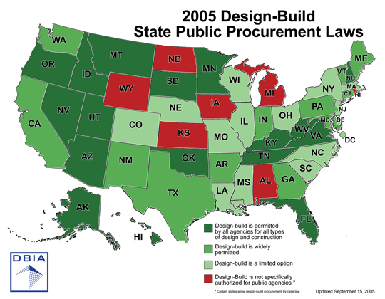
The green shadings made sense at the time, because every state had design-build authorization in some way, even if it was through a pilot program that would eventually expire. To show the development of design-build we also created maps to represent the past years of 1993 (when DBIA was founded) and 2005.
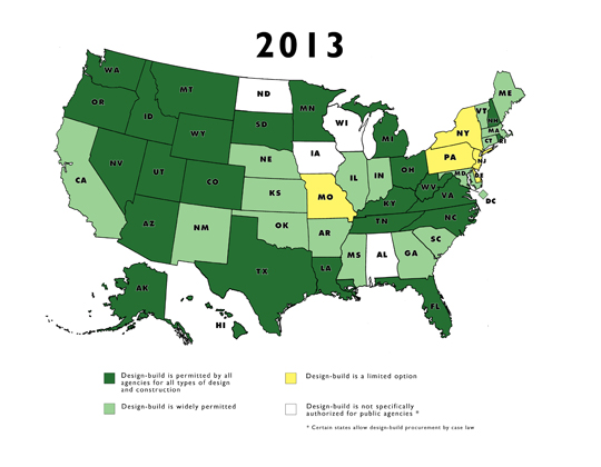
As more states began to adopt design-build, we wanted to better highlight states with limited authority, so we settled on the idea of a state shifting from white to dark green (with yellow as the transition color) as design-build received greater approval. Our 2013 map, as a result, came out more crisp, readable and modern.
New maps
Thanks to a careful debate between teammates, our maps have taken on a completely different look within the past few months. During a team meeting held in the late summer months of this year our Vice President of Advocacy and Outreach, Louis Jenny, concocted the idea to give each of our maps a uniquely identifiable color. Todd Rich, our Manager of Web/Graphic Systems, was tasked with achieving this goal and chose a color scheme that aligned with our series of documents on design-build best practices (green for general/universal, orange for transportation, etc.). After numerous edits (and I mean numerous), we finally arrived on an appropriate shading and arrangement.
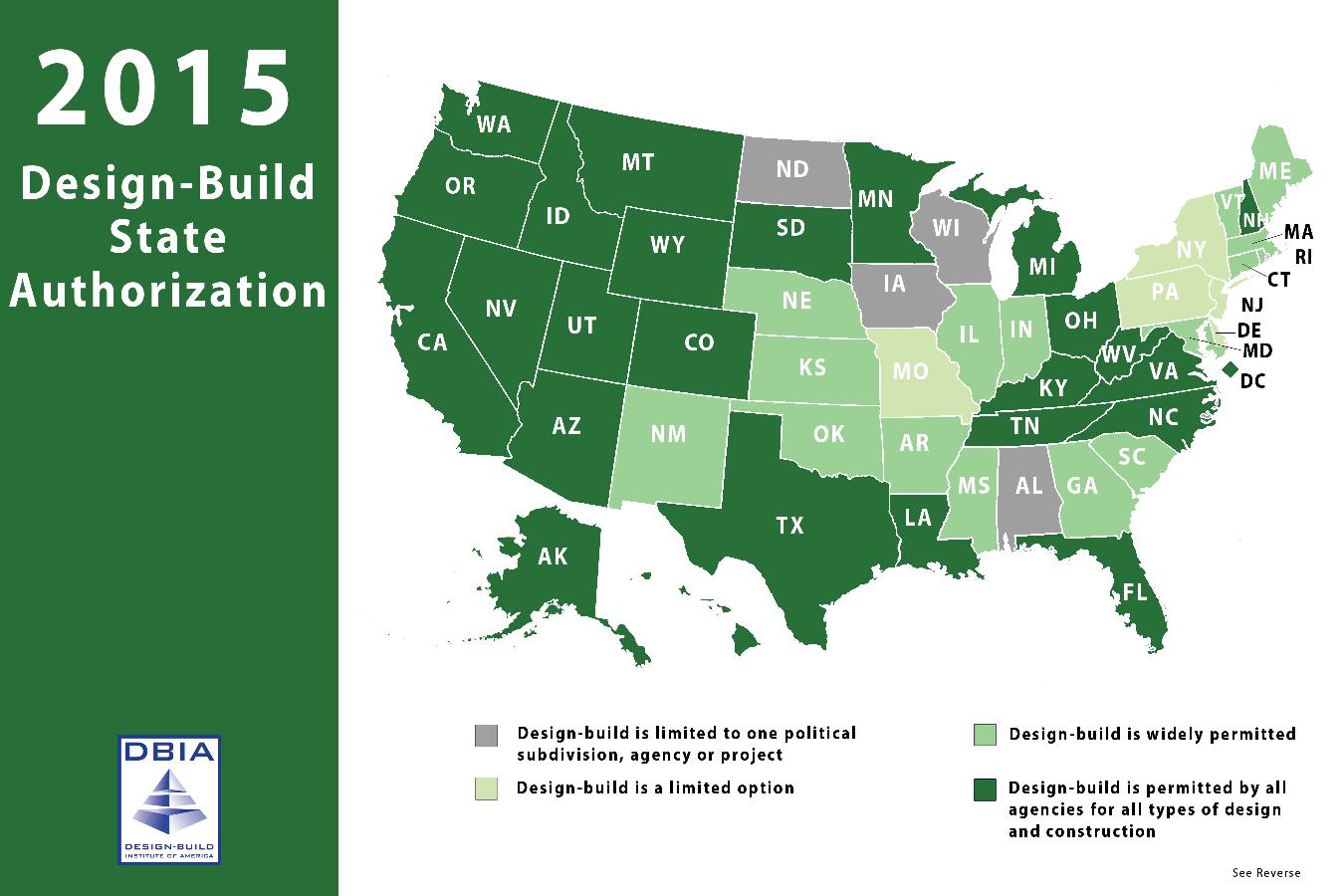
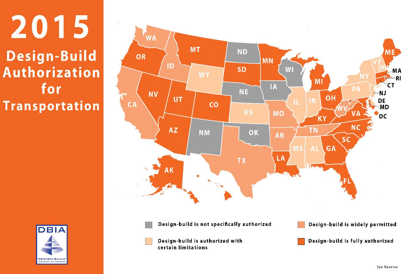
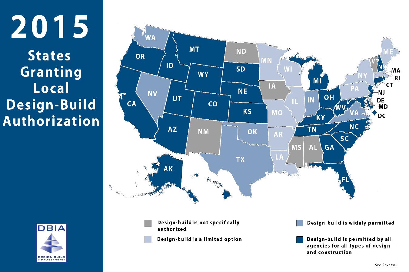
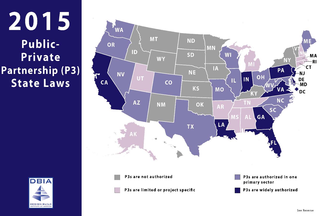
Making our maps more unique serves a purpose that has grown out of the diversity of design-build laws. Design-build transportation laws are very different than local authority and P3 authority. The assignment of different colors to each map allows readers to quickly distinguish the maps and understand that design-build laws differ based on the sector. As a result, what you see today are sharp, modern maps that are not easily mistaken for one another.
Why new materials are important
The value of improving materials is not only limited to our advocacy efforts, but it’s important for us at DBIA to establish innovation as a mindset and a part of everything we do. It’s important to always question the standard operating procedure and constantly be asking: How can we make this better? The improvements to our maps made their presentation more appealing, but they also reminded us that our efforts to promote Design-Build Done Right can always be improved.
To view all of our new maps, click here.